Discover OpenAIR’s Visual Guide: This page provides our partners and sponsors with the logos, colours, typography, and guidelines needed to represent OpenAIR accurately and consistently across all materials. We ask that you take a moment to familiarise yourself with these standards before using our brand assets.
Approved OpenAIR Logos
Our logo is the cornerstone of the OpenAir Africa brand — please use only the approved files provided here and never alter, distort, or recreate it in any form.
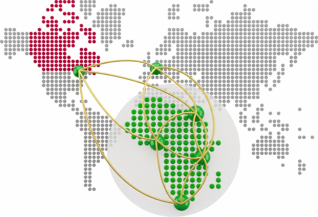
Horizontal Logos
Vertical Logos
Logo minimum sizes
Vertical logo
Print: 0.75 in (1.91 cm)
Web: 72 px
Horizontal logo
Print: 1.25 in (3.175 cm)
Web: 150 px
Colours


Typography
Poppins
Poppins is OpenAIR’s typeface — a clean, modern geometric font that brings clarity and confidence to everything we publish, from headlines to body copy.
Guidelines
Poppins is the primary driver of the OpenAIR brand voice. Its clean, geometric design strikes a perfect balance between professional authority and a friendly, approachable vibe. This typeface is versatile enough to anchor a bold headline or clarify a detailed caption, all while reflecting our brand’s unique “dual spirit”: a foundation in African context paired with a drive for global innovation.
Design Principles:
- When working with Poppins, focus on these core elements to maintain brand integrity:
- Structure & Hierarchy: Use font weight and size to guide the reader’s eye, emphasizing key information within a clean, purposeful layout.
- Space to Breathe: Prioritize generous tracking and line height to ensure maximum readability across both digital screens and printed materials.
- Preferred Weights: Stick to Regular, SemiBold, and Bold to keep our visual identity consistent. Refer to our brand gallery for approved typographic treatments.
The Golden Rule:
- To keep our look unified, no other typefaces are allowed in OpenAIR materials. If you feel the need to use an alternative weight or a different font entirely, you must obtain written approval from the brand team first.
Contact Us
If you have a question or need support collaborating?